Standards
There are several elements that are essential on your map. They include a title, a scale bar and/or scale text, a legend, source statement(s), copyright, disclaimer, logos, and cartographer’s name. If your map covers a small area, it is appropriate to use a north arrow.
There are two views in ArcMap: the data view and the layout view. To create the map layout, click the layout button (located in the bottom left of the map area). You also need to add the layout toolbar.
Tutorial: General layout set up
1. Click the layout button to see the map in layout view.
2. Decide the extent at which you wish to view your data. Use your zoom and pan buttons on the Tools toolbar to move around the map.
3. Click File and select Page and Print Setup. You can adjust your page size here.
4. Choose an appropriate scale. It is best to have a scale that is easily referenced to other scales. However, a round scale may be the best you can do. For example, 250,000 is a standard map scale. However, it may not fit all your data – so you would choose 1:275,000 as opposed to 268,473.
Tutorial: Layout elements
You may want to have an information bar around the map, which will hold all your elements together. This bar can be located at the bottom, top, left or right.
 1. From the drawing toolbar, draw an information bar using the New Rectangle button
 . This will be where you place all your information elements. You can adjust the size later, but make an informed estimate the size you’ll need.
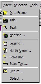
2. Click Insert and then select Title. A new text box appears. Enter the title of your map.
3. Click Insert and then select North Arrow. Choose a North Arrow that is appropriate for the “feel” of your map. Click OK.
4. Click Insert and then select Scale Bar. Choose a Scale Bar that is appropriate for the “feel” of your map.
5. Click Properties. On the Scale and Units tab, change the Division Units to meters or kilometres. Click OK. Click OK again.
6. Click Insert and select Scale Text. Select Absolute Scale and then click OK.
7. Click Insert and select Picture.
8. Navigate to where you store logos and select the appropriate version to include on the map. Click Open.
9. Now, you can click and drag the elements around in your information bar. Don’t forget to leave room for the legend!
Note: You can easily change the properties (size, font, format, etc.) of any of the elements listed above by right-clicking on the element and selecting Properties.
Tutorial: Legend
The legend of the map provides the key to its elements. If the map is simple and self-explanatory, you may not need to include a legend. However, until you are a comfortable cartographer, it is wise to include one by default.
1. Click Insert and select Legend. The Legend Wizard opens.
2. Using the arrow buttons, add and remove map layers as necessary. Click Next.
3. Change your Legend Title, if necessary
4. Set a Legend Frame if you wish.
5. Change the default line and/or patch if you wish.
6. You can leave the Spacing between the items at their default.
7. Click Finish. You now have the beginnings of a beautiful legend to work with.
8. Right-click on the Legend and select Properties. You can modify the legend’s properties in this dialogue box.
9. The Items tab is very useful. Highlight the layer and you can:
• Add and remove layers using the right and left arrows
• Change the order in which layers appear in the legend using the up and down arrows
• Begin a new column in the legend by checking the Place in new column box
• Change the number of columns that each layer uses by increasing the number in the Columns box
• Change the formatting by clicking the style button, then selecting Properties. The Legend Item dialogue box pops up and you can choose which descriptive information appears, as well as change the font and default patch/line.
You can find plenty of useful information about designing effective legends at ESRI’s Mapping Centre blog:
http://blogs.esri.com/Support/blogs/mappingcenter/archive/2008/03/06/cartogrpahic-design-legends.aspx
Tutorial: Inset maps
You can create an inset map to magnify a certain location, or to show the location of the map in the greater scheme of things.
1. Click Insert and select Data Frame. This inserts a second data frame on your map layout and into your table of contents.
2. Right-click on the data you want to copy into the inset map and select Copy.
3. Right-click on the new data frame and select Paste Layer(s).
4. You can select the new data frame and scale it and move it to the correct placement.
5. You can also use the data frame tools to interact with the features and choose the extent you desire.
6. On the larger data frame, right-click in the table of contents and select Properties.
7. Click the Extent Rectangles tab.
8. Highlight the data frame name and click the arrow to move it to the second box.
9. Click OK. The new data frame automatically shows where the other map is located.
You can read more about data frames and inset maps at the ESRI Mapping Centre’s blog:
http://blogs.esri.com/Support/blogs/mappingcenter/archive/2008/12/12/db.aspx
and http://blogs.esri.com/Support/blogs/mappingcenter/archive/2008/03/04/cartographic-design-inset-maps.aspx
Colours
Certain colours evoke certain emotions. For example, think of the colours red white blue. What does it make you think of? How about red and green? You should consider your audience and choose appropriate colours that don’t distract. Older people tend to like muted pastels, whereas children prefer bright primary colours. There are also generally established colour guidelines for various map themes, such as geology. Here are some guidelines that you may wish to use:
| Theme | Colour | Alternate Colour |
| Parks | Green | Brown |
| Water | Blue | (none) |
| Roads | Red/Brown/Orange | Black/Grey |
| Boundary | Black | Grey |
The use of colour is also important. There are four types of colour schemes to consider: sequential, diverging, binary and qualitative. See here for more information:
http://www.personal.psu.edu/faculty/c/a/cab38/ColorSch/Schemes.html
Typography
Typography in cartography can be very time consuming, but often is the factor that polishes a map. I suggest reading “Positioning Names on Maps” by Eduard Imhof (available here: http://www.mapgraphics.net/downloads/Positioning_Names_on_Maps .pdf) for an overview of the many different rules. Here are some guidelines for colours that you may wish to use:
| Feature Type | Serif or Sans Serif | Colour |
| Place names | Serif | Black |
| Boundary lines | Serif | Black |
| Treaty, Grant Reserves | Serif | Red |
| Parks | Sans Serif | Green |
| Water features | Serif with Italics | Blue |
| Roads and trails | Sans Serif | Black |
| Landforms | Sans Serif | Black |
Please try to use only two fonts on your map: one SERIF font and one SANS SERIF font. You can create hierarchy using the size of the font, capitals, colours, etc.
Tutorial: Typography
1. Open the layer properties for the feature you want to label.
2. Click the Label tab. Check the Label features in this layer box.
3. Choose the correct Label Field.
4. Change the font, size, and colour to reflect the layer you’re labelling.
5. Click OK.
Tutorial: Placement properties
1. From the Labels Layer Properties box, click on Placement Properties. A new box pops up.
2. On the Conflict Detection tab, you see the Place overlapping labels box. You can check this box to force ArcMap to show you all of the labels, even if one or more are overlapping.
3. On the Placement tab, you will see three options for Duplicate Labels. These options are important for polygon features that have several different smaller pieces that form the same polygon – for instance, a reserve or a park that has several parts but only one name. Depending on the scale, we may only want to have one label for the polygon. This is also important for rivers which may be broken up into many different lines. Experiment with the three different options and see which one fits your data requirements best.
Tutorial: Annotation
You may want to manually edit the location of text in your map. To do so, you must first convert the labels to annotation.
1. Right-click on the layer that you want to convert labels to annotation. Select Convert Labels to Annotation.
2. In the Store Annotation box, select In the map. You can also opt to store annotation In a database. If you do so, you will be able to reuse the annotation at a future time. However, it is harder to edit the annotation in a database.
3. Click Convert.
4. Click the Focus Data Frame button![]() . A fuzzy line appears around your data frame.
. A fuzzy line appears around your data frame.
5. You can now edit the labels individually, or change their placement.
Cartography Resources
You may find these websites useful in your cartographic exploration. Note: many use a Flash interface. You may have to download a plug-in.
Mapping Centre: http://mappingcenter.esri.com/
Mapping Centre offers a blog (with excellent tips and workflows), an Ask a Cartographer section, ArcGIS Resources (including symbols, styles, scripts, and queries for download), and Other Resources (has a variety of presentations and publications). It is an excellent resource for all ArcGIS cartographers.
TypeBrewer: http://www.typebrewer.org/
TypeBrewer is a free help tool that gives non-specialist mapmakers a chance to explore typography in a semi-structured environment. It offers a quick and easy way to explore typographic alternatives and see the impact that various elements of type have on the overall look and feel of a map. TypeBrewer is designed for mapmakers who want to learn more about map typography and get practical design specifications for starting a map project.
ColorBrewer: http://www.colorbrewer.org
An online tool designed to help people select good colour schemes for maps and othergraphics.
Cartotalk:http://www.cartotalk.com
A forum to ask questions, offer knowledge, and post maps for feedback. Cartotalk is a very useful, active and interesting site.
Kuler:http://kuler.adobe.com
Kuler is an online application that generates colour themes. You can download themes to use in Adobe applications, or copy the CMYK/RGB/HSV values to use in ArcMap.
Icons
It’s nice to use icons that represent point features on your maps. For example, using a fish icon instead of a circle to represent fishing points on a map makes the content easier to understand. ArcMap comes with a variety of icons, which you can access through the Properties button in the Symbol Selector dialogue. To use your own picture icons within ArcMap, it is best if you have a true type font, or emf or bmp files. Once you have your picture icons ready to use, you can add them to your map.
1. Open the Symbol Selector dialogue box.
2. Click Properties and select Picture Type from the drop-down box.
3. Select your bitmap or emf image.
4. Click OK.
Your point now has that image as its icon.